Today, when the process of computerization of the world is experiencing unparalleled success and the Internet is becoming the most convenient collection of various media, web designers and developers also have to change the way they work.
When the gadget market was still at its beginning, there was only one requirement – web sites for desktop computers. However, today it is much different. Due to the versatility of various devices that can access the Internet, web developers need to have ready solutions for different gadgets and ensure that all of them can access web sites in a smooth and fast way. Consequently, they have to try to meet new conditions and find the most optimal way for creating web sites that can be easily visited from any device visitors might be using and still keep the content rich and purposeful. Sounds like an activity between the real art and science fiction, but it is possible and many creative web designers succeed in doing it.

Bottom-up strategy
Although the first steps in mobile web design had to be made from the desktop point of view, the perspective has changed today, so now designers first start from mobile versions. Of course, if they opt for separate types of web sites for different devices. That is only one way of becoming more gadget-oriented. A different way is applied when you want to make a web site from scratch. Today many web designers first have mobile platforms on their mind and think in that system. After that, they extend the image and start thinking in the tablet-friendly way. Finally, as the strategy goes from the bottom to the top, they finish with details for desktop computers. A fine example of such a gradually upgraded strategy can be found in the Barack Obama’s election campaign and its web strategy.
Apps before sites
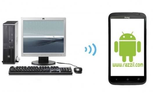
When it comes to mobile phones and smart phones, a pretty new feature has been developed over the last few years – the concept of applications. Applications function inside a given system, which is the operative system of the smart phone. They are developed by app developers and they are downloaded to the device itself. The great thing about apps is that you do not waste time roaming in the net, looking for sites, waiting for them to respond to your gadget. Through apps, you have a clear and direct access to the information you need. What is more, you can use apps offline if there is no Internet connection and store everything that needs to be uploaded the moment you get the connection.
The drawback of this concept is that apps are not visible as web sites are, but you need to go to app stores to choose and download the app(s) you want. This might be inconvenient, especially if you do not know what you are looking for.
Content optimization
The key to keeping the visitors’ attention on your site is well-organized content. Forget about reducing the content for mobile versions if you are planning to make separate types of sites. Users often use two, three devices in one day and they want to have access to the same amount of information. Instead of that, make the content suitable and the site responsive for all platforms and devices, so that your sites continues attracting visitors and providing services as it did before the mobile web design (r)evolution.
About The Author: Dan Radak is hosting security specialist. Currently employed as a consultant in Sydney Digital Agency. Lately, he has been interested in ecommerce and web design. In his free time he lakes traveling and fishing. You can reach him on Twitter.