Specify the Choices
To specify the choices that users can choose from, you simply type the choices in the box titled Type Each Choice on a Separate Line (refer to Figure 14). You use a line break to separate choices. For example, for a list of countries, you type the countries in the box with a line break between each country name.
Choose How the Choices Will Be Displayed
The next configuration setting you can set is how the choices are displayed to the user. The first two options, Drop-down Menu and Radio Buttons, enable users to select only one option from the list of choices, whereas the last option, Checkboxes, allows multiple selections of values.
The Drop-down Menu option is useful when you have a lot of choices and don’t want to overwhelm users. The values appear in a drop-down menu, which opens to reveal the list of choices (refer to Figure 12).
The Radio Buttons option is useful when the list of choices is small and will not take a lot of space on the page. The advantage of this option is that the user sees all the options on the page without having to open a drop-down menu (refer to Figure 13).
The Checkboxes option is useful when you want the users to be able to choose more than one option (refer to Figure 11).
Allow Fill-in Choices
When you choose to allow fill-in choices, the column enables users to type a value if the value they are looking for does not exist in the list of choices you chose (see Figure 15). The values that users type are not added to the list.
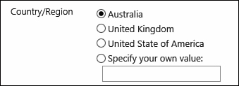
FIGURE 15 When the Allow Fill-in Choices option is enabled, users can type a value manually.
Default Value
As with most other column types, you can type a default value that will be selected when the user creates a new item. If you want nothing to be selected by default, you clear the Default Value box; otherwise, you need to make sure you type in the Default Value box the exact text of one of the choices.
Number (1, 1.0, 100)
The Number column type is useful when you want to capture a numeric value. With this column type, the user is asked to type a number in a text box. For example, you might ask for a 1-to-10 rating for a document or the number of products in stock. Figure 16 shows the settings for this column type.
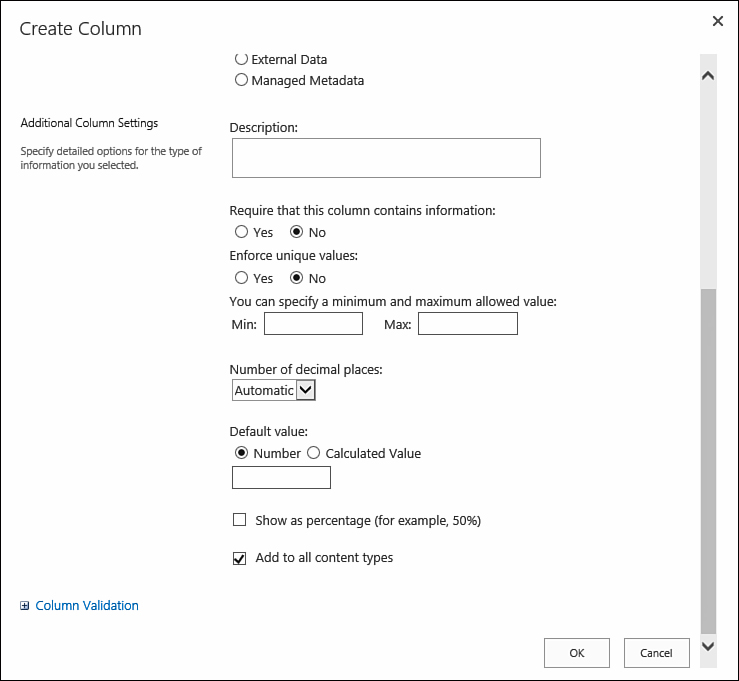
FIGURE 16 The configuration options for the Number column type.
Minimum and Maximum
With this option, you can configure for a Number column the minimum and maximum numbers that the user can choose in the value.
Number of Decimal Places
In the Number of Decimal Places option, you configure how many decimal places the value can have. If you choose the value 0, fractions of numbers are not allowed; only integers are allowed. Choosing the value 1 enables users to specify numbers with one decimal place, such as 15.4. Choosing the value 2 allows a precision of two decimal places, and so on up to five decimal places. The default option for this setting is Automatic, which displays how many decimal points are in the entered number.
Show as Percentage
Choosing the Show as Percentage option causes the value entered in this column to be displayed as a percentage.
Default Value
Like other columns, this column supports a default value that you can enter as a static default value or as a calculated value. This column supports many mathematical formulas using standard arithmetic operators (such as +, -, *, and /) to perform calculations. For example, you can have a calculated default value of =128+10, which results in a default value of 138. Another option is to use special functions in the calculation. Number columns support such functions as Pi(), which returns the number for pi; AVERAGE(), which returns the average of the numbers you give it; and MAX, which returns the biggest number in the list of numbers you give it.
Tip
As you can see, having calculated defaults for the Number column is not extremely useful; essentially, you are typing in a static number. However, these formulas do work in this column type, and you might find a use for them.
Currency ($, ¥, €)
The Currency column type is almost exactly the same as the Number column type. The only option that is different in the Currency column type from the Number column type is Currency Format. This option determines what symbol will be used next to the value when displaying the value in the item’s or file’s properties. For example, choosing United States displays values with the dollar sign ($) next to the value, whereas choosing one of the European countries displays the euro sign (€) next to the value.
Date and Time
The Date and Time column type lets users specify a date or a date and time as the value for the column. For example, in a calendar list, users can specify the start date and time of a meeting. However, for a list of contacts, if you want a column with the birth date of a contact, for example, you need to configure the column to ask only for the date, not for the time. Figure 17 shows the two modes for this column.
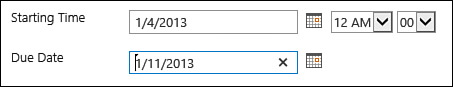
FIGURE 17 Two date and time columns: one shows only dates and the other shows date and time.
Figure 18 shows the configuration options for this column type.
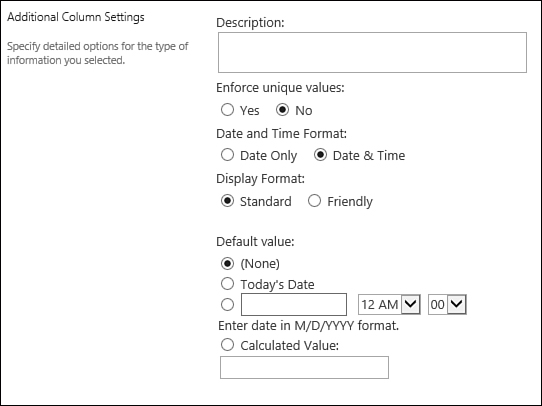
FIGURE 18 The configuration options for a Date and Time column type.
